What the map measures: daily maximum surface-air temperature
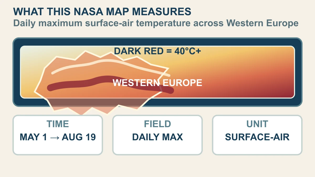
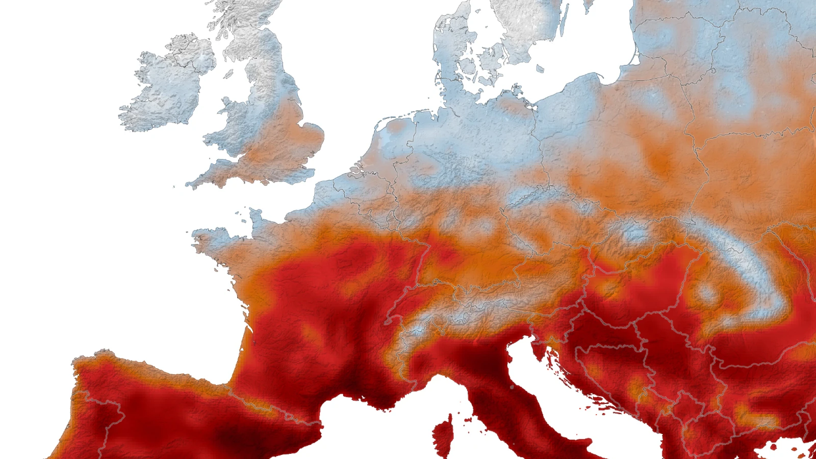
The short answer is that NASA's animation is a time-compressed map of a GEOS-FP temperature field. It shows daily maximum surface-air temperature across Western Europe from May 1 through August 19, 2026; the darkest red marks areas at or above 40°C. Read it as a modelled atmospheric analysis built from observations and GEOS output, not as a wall-to-wall set of thermometers or a satellite camera directly measuring every pixel.
“Daily maximum” is the key phrase. Each location in the mapped field is represented by the highest surface-air temperature value for that day, so the sequence can show hot areas appearing, spreading and easing as the summer progresses. The dates bound what the animation can establish: it is a retrospective view of a specified period, not a promise about the next heat wave, a local forecast, or a health alert for an individual.
That distinction makes the map more useful, not less dramatic. A colour threshold gives a fast answer to where the modelled field reached 40°C or more, while the time axis gives the question a second dimension: when did that pattern occur? The map begins the explanation; the rest of the answer has to show how observations and atmospheric equations are combined, and where interpretation would go beyond the evidence. That is the difference between reading a map and treating it as a verdict.
How observations and GEOS turn data into a map
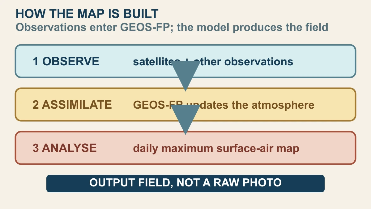
NASA's Earth Observatory says the animation was produced by combining satellite observations with temperatures predicted by GEOS. NASA's Global Modeling and Assimilation Office describes GEOS-FP as an atmospheric data-assimilation system that takes in millions of observations each day. Those observations help update the model's description of the atmosphere, giving the system a starting state for analyses and forecasts rather than leaving the map to a single sensor's view.
Assimilation is not the same as pasting satellite pixels onto a blank map. GEOS uses equations that represent atmospheric processes, then uses observations to constrain or update the modelled state. The result is a coherent field that can be compared across time and space. That is why the NASA visual can show a continuous regional pattern even though observations arrive through different instruments, locations and measurement types.
The practical reading rule is simple: satellite observations are part of the evidence stream, GEOS supplies the modelled atmospheric field, and the animation displays the resulting daily maximum. It would be misleading to say that a satellite photographed the temperature at every coloured point. It would also be too weak to call the image a purely invented illustration: it is an analysis product anchored by observations and a documented modelling system.
What the map shows—and what it cannot prove
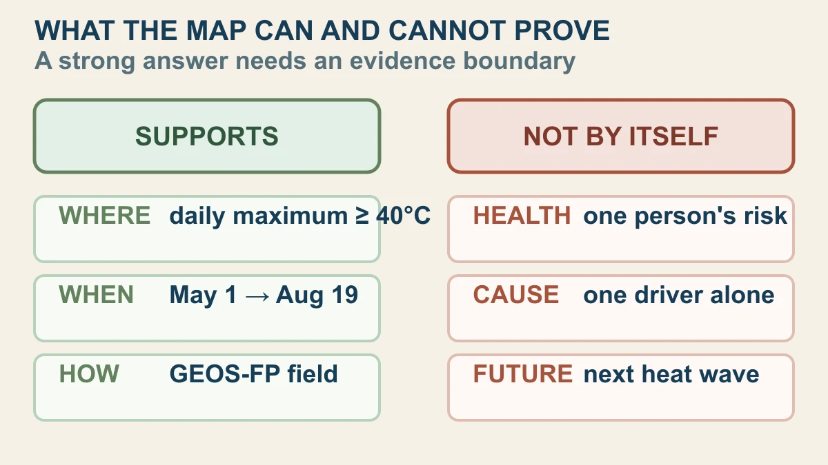
The map directly supports three claims: the stated date window, the spatial pattern of the daily maximum surface-air-temperature field, and the legend's dark-red threshold. It can help a reader see that heat was not one uniform blob across Western Europe. It cannot, by itself, tell one person what their body will experience, which neighbourhood had a specific exposure, or whether a clinical warning should be issued.
Nor does the animation alone prove one cause for every hot area or predict the next heat wave. Attribution needs a separate method and evidence base; forecasting needs a future initial state, forecast run and uncertainty treatment. The GMAO source trail explains what GEOS products are for, while NASA's feature supplies this dated map. Keeping those roles separate prevents a compelling visual from carrying claims it was never designed to establish.
That boundary is the payoff. NASA's map turns a long, complicated summer into a readable sequence, but the mechanism makes the reading honest: observations constrain a physics-based model, the model produces the field, and the field is summarised by a daily maximum. You can ask what happened in this window without pretending the animation answers every question about cause, health or the future.
Sources and further reading
This article was written for Curiosity Desk. We do not copy other publishers or invent quotes. If a material error is found, we correct it openly.
Read the full standards →One answer should lead to a better question
Bring your curiosity to the group
Curious Minds is our public Facebook community for surprising science, strange history, Australian wildlife and everyday questions. No copied posts, no personal-friend invitations and no link dumping.
- Three self-contained discussion prompts each week
- Sourced answers and honest uncertainty
- Respectful conversation without spam