A colour image can contain three different measurements
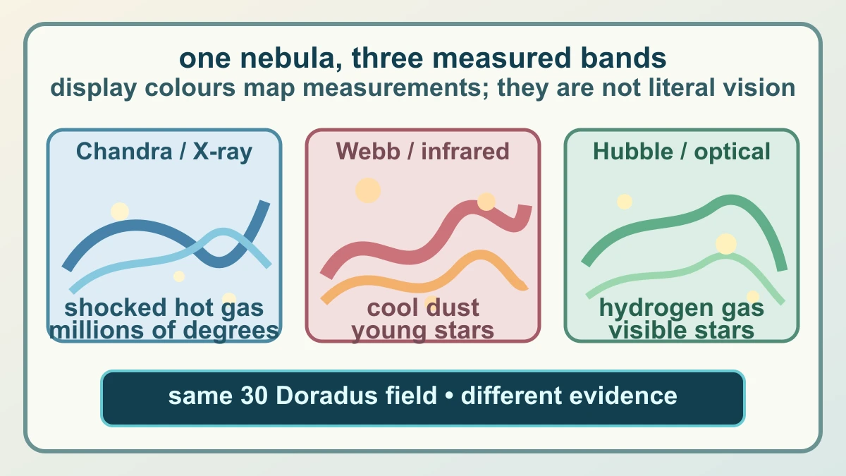
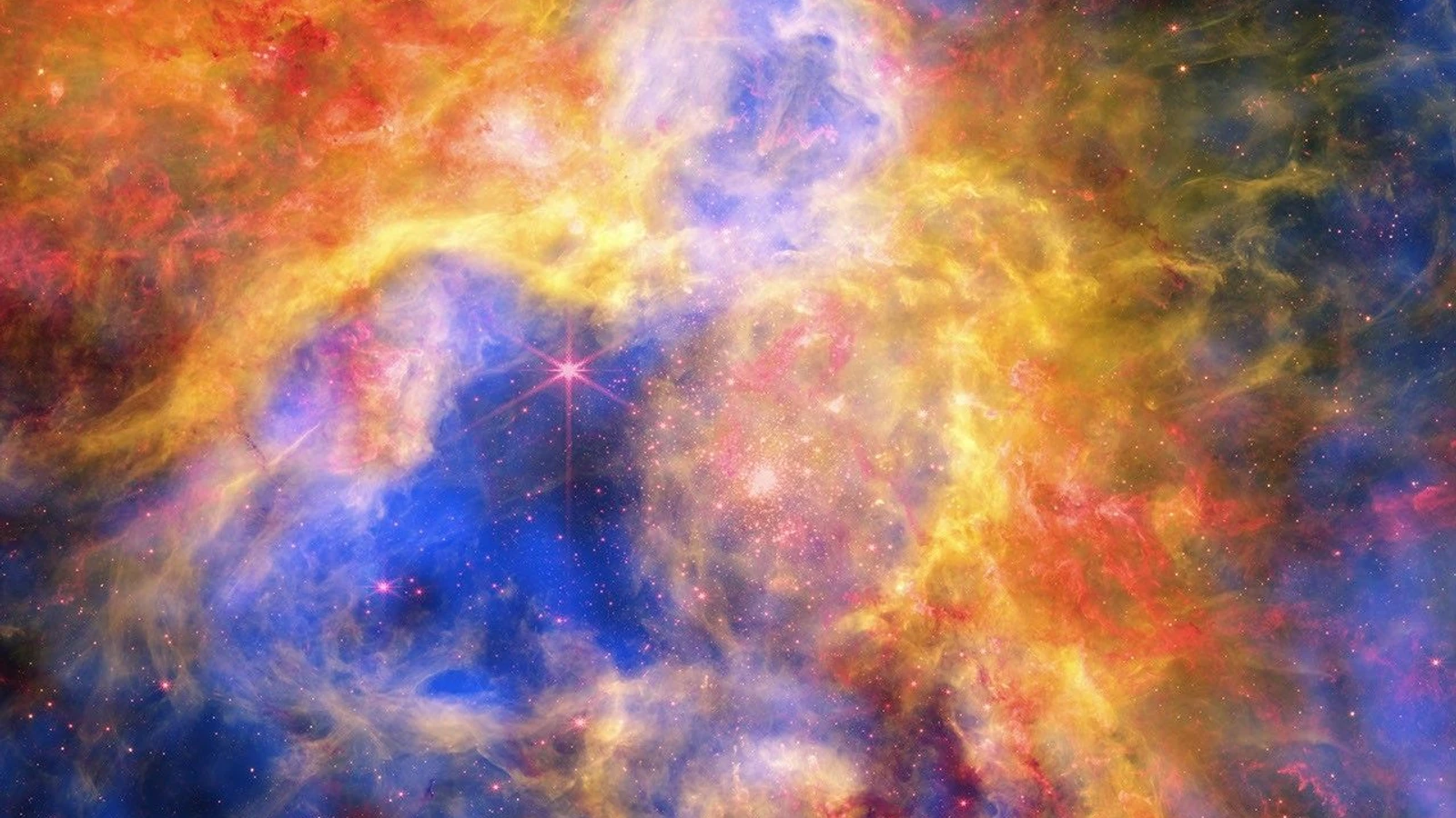
The Tarantula Nebula, also called 30 Doradus, is not being photographed three times in red, green and blue. The new NASA composite is an aligned display of observations made in different parts of the electromagnetic spectrum. A colour in the finished picture is a visual assignment that helps a reader see where a measured signal is strong; it is not necessarily the colour a human eye would see there. That distinction is the key to reading the image without mistaking a data map for a conventional photograph.
30 Doradus sits in the Large Magellanic Cloud, a small neighbouring galaxy about 160,000 light-years away, and contains thousands of young stars in a complex structure of gas and dust. In visible light, some of that structure can be traced through glowing hydrogen and individual stars. Infrared observations reveal cooler dust and young stars that are difficult to separate from the surrounding material in ordinary visible light. X-rays add a much hotter component: gas heated to millions of degrees by shocks associated with winds from massive young stars.
The composite therefore gives the same patch of sky several jobs at once. It can show where hot gas sits relative to dust shells, where optical hydrogen outlines a boundary, and where young stars occupy or illuminate those structures. It does not make the layers identical. Each instrument has its own sensitivity, resolution, observing history and calibration. The useful question is not which colour is the real nebula, but which physical measurement each colour is standing in for.
Each telescope adds a different kind of evidence
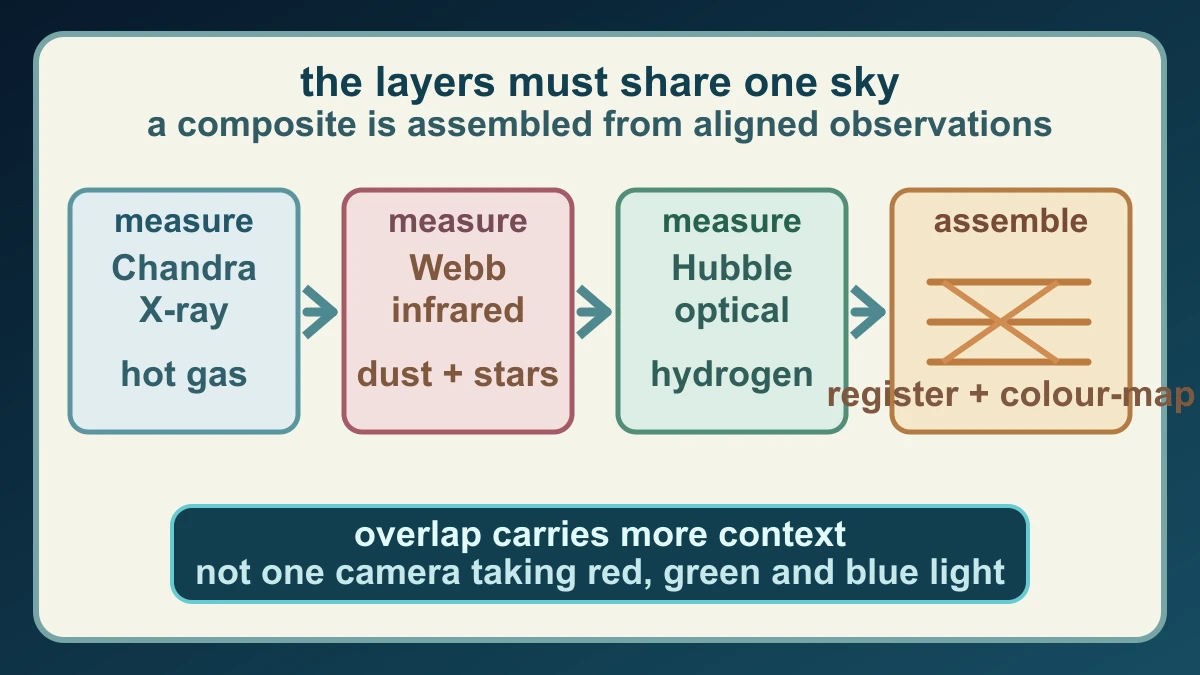
NASA's Chandra X-ray Observatory supplies the blue layer in the new composite. Its data reveal hot gas blown away by winds from young, massive stars and heated by shock waves, a little like the heating around a supersonic aircraft but on a vastly larger scale. X-rays can therefore mark energetic gas that is invisible in an ordinary optical image. The Chandra contribution is not a blue photograph of the gas; it is a processed view of X-ray measurements mapped into a display colour.
The red layer comes from the James Webb Space Telescope's infrared observations. Infrared can pass through and respond to cooler dust in ways that visible light cannot, while also revealing thousands of young stars. The green layer comes from the Hubble Space Telescope's optical data, which show hydrogen gas and some individual stars through the nebula. The layers overlap in places, but overlap is informative only when the observations have been registered to the same sky coordinates and their different measurement roles remain visible.
That is why the source credit matters as much as the picture. The published composite combines Chandra data, Webb data and Hubble data, with image processing by the Chandra team; the exact credit names NASA, ESA, CSA, STScI, Ohio State University, the researchers and the processing team. The paper's multiwavelength analysis also uses a large Chandra observation together with Webb, Hubble and retired Spitzer data. The finished image is a carefully assembled summary of evidence, not a claim that one telescope saw all of the colours at once.
The missing energy question comes after the picture
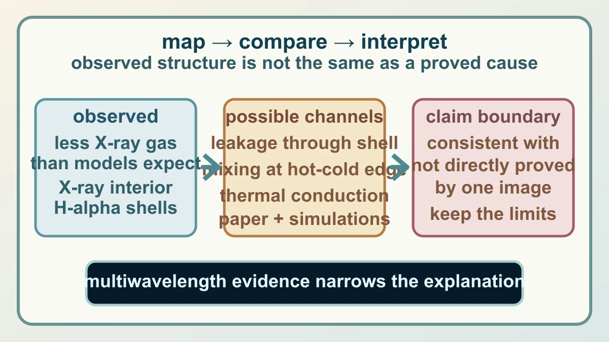
The composite becomes scientifically interesting when researchers compare the layers with what stellar-wind models predict. Massive stars inject energy into their surroundings through winds and later explosions. Those models suggest that the hot gas should produce more X-ray emission than the observations show. In the 30 Doradus study, the researchers therefore asked where some of the expected energy could be going rather than treating the colour contrast as an answer by itself.
The paper and NASA's explanation point to several possible channels. Some hot gas may leak through gaps or shell walls. Turbulent mixing at the boundary between hot and cooler material can change the observable temperature structure. Thermal conduction can transfer heat between the phases, changing the amount of gas that remains hot enough to emit strongly in X-rays. These mechanisms are not three colours with three labels; they are physical explanations tested against the spatial and spectral relationships in the data and against computer simulations.
The honest conclusion is narrower than the picture's drama. The combined observations show a complex arrangement of stars, dust, warm hydrogen and hot X-ray gas, and the study finds that the hot-gas energy budget is lower than a simple model would suggest. The evidence is consistent with leakage, mixing and conduction contributing to that difference, but one composite image does not directly prove which process dominates everywhere. The strength of the method is that several measurements can constrain the same question; its discipline is keeping an observed layer, a model comparison and a possible explanation in separate boxes.
Sources and further reading
- NASA Science: NASA Telescopes Create Colorful ‘Craft’ From Nearby Nebula ↗
- NASA: Colorful Collage of Tarantula Nebula ↗
- arXiv: Taming the Tarantula: How Stellar Wind Feedback Shapes Gas and Dust in 30 Doradus ↗
- NASA Science: Chandra X-ray Observatory ↗
- NASA Science: Massive Star-Forming Region in 30 Doradus ↗
- NASA Science: Vast Star-Forming Region 30 Doradus ↗
- Chandra Photo Album: The Enduring Stellar Lifecycle in 30 Doradus ↗
- NASA Images and Media Usage Guidelines ↗
This article was written for Curiosity Desk. We do not copy other publishers or invent quotes. If a material error is found, we correct it openly.
Read the full standards →One answer should lead to a better question
Bring your curiosity to the group
Curious Minds is our public Facebook community for surprising science, strange history, Australian wildlife and everyday questions. No copied posts, no personal-friend invitations and no link dumping.
- Three self-contained discussion prompts each week
- Sourced answers and honest uncertainty
- Respectful conversation without spam