Why the same nebula changes across wavelengths
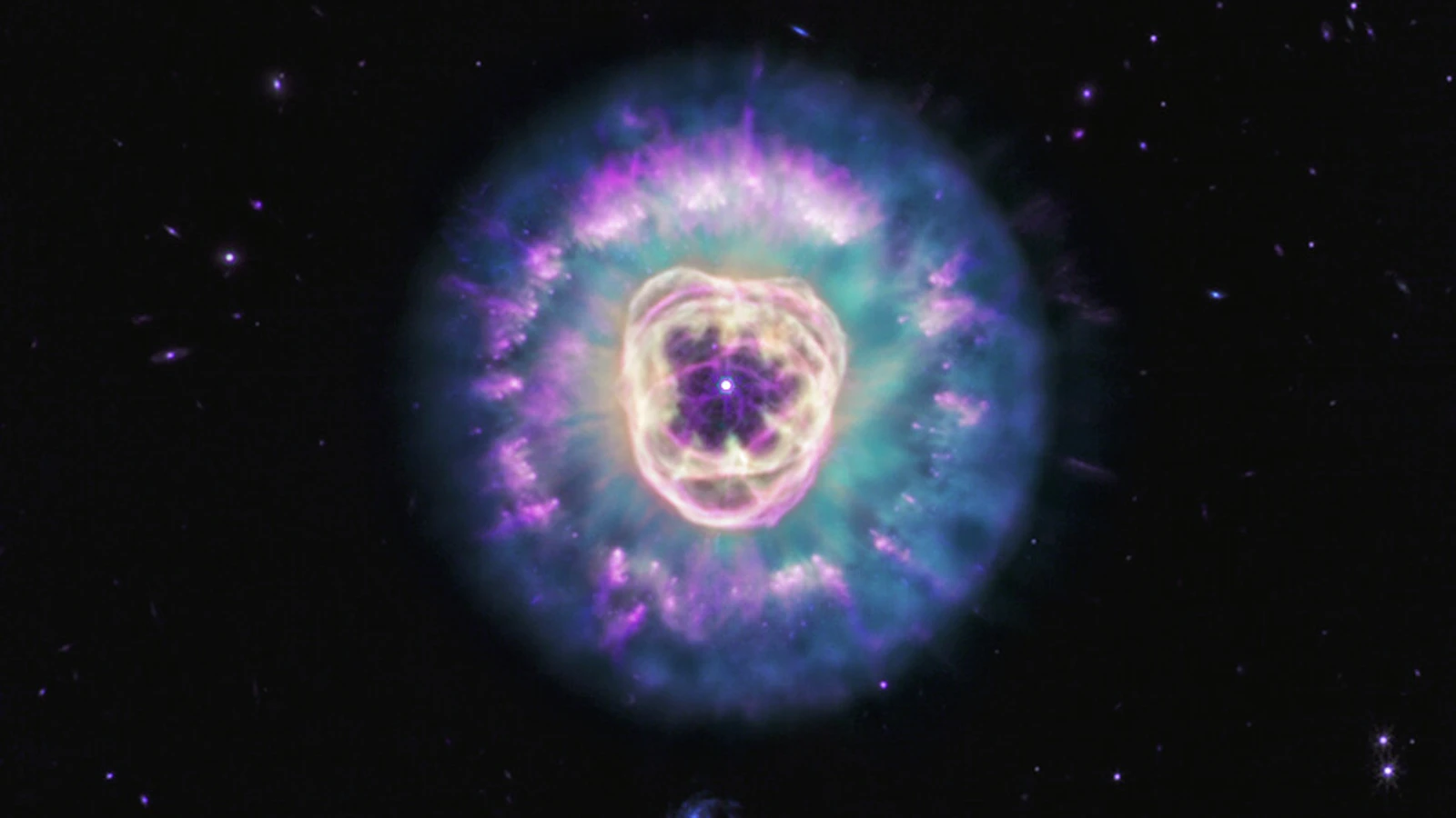
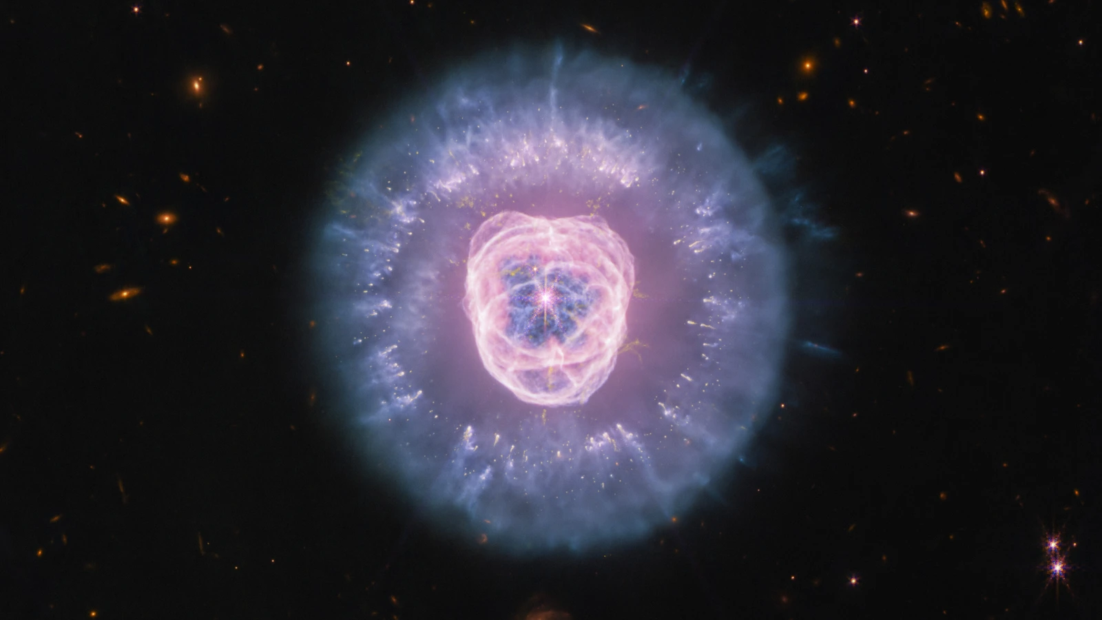
The short answer is that Webb is not taking one sharper version of the picture Hubble took. It is sampling NGC 2392, the Lion Nebula, through selected infrared filters. Those bands respond to different light from the nebula, so a combined image can make its gas, shells and dust appear in a different balance. The colours are assigned during image processing to make those measurements readable; they are not what a human eye would see from the nebula.
The comparison is useful because Hubble’s visible-light view and Webb’s infrared views can preserve the same broad lion-like shape while emphasising different structures. NASA and ESA/Webb describe Webb’s images as highlighting compact dust clumps and haze of ionised gas. The shape is therefore not a contradiction between telescopes. It is a reminder that a nebula is a physical scene whose light carries different information at different wavelengths.
The MIRI-only image makes the distinction especially clear. Its mid-infrared view brings out the dust structures that form the mane, while the central bubble of ionised gas remains part of the larger story. That does not mean every purple, cyan or pink patch is a separately photographed object. It means the processing has used selected measurements to show patterns that the source release interprets as dust and ionised gas. The image is most useful when the reader can hold both ideas at once: the structure is real, but its displayed colour is a translation.
What NIRCam and MIRI each contribute
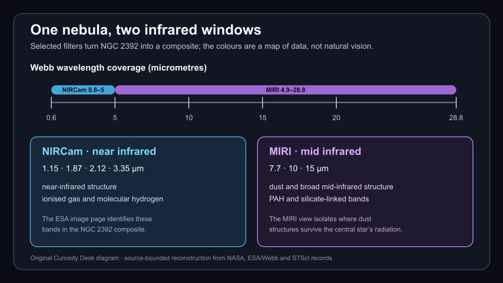
NIRCam is Webb’s near-infrared imager, covering roughly 0.6 to 5 micrometres. The ESA/Webb record for the combined NGC 2392 image identifies near-infrared bands at 1.15, 1.87, 2.12 and 3.35 micrometres. Those bands are not four ordinary colour channels. They are selected windows through which astronomers can compare the brightness and shape of features associated with the nebula’s gas and dust. A filter narrows the question before the detector ever records the signal, which is why the instrument list belongs beside the image rather than in a footnote.
MIRI works farther into the mid-infrared, with NASA describing coverage from about 4.9 to 28.8 micrometres. The ESA/Webb record lists 7.7, 10 and 15 micrometre bands for its MIRI image and identifies PAH and silicate-linked context. In plain language, MIRI gives the observation a longer-wavelength view of the dusty environment, while NIRCam contributes a nearer-infrared view of the shells, gas and molecular features selected for the composite.
The instruments do not produce two competing answers. They provide complementary measurements of the same target. In the official interpretation, the dying star’s radiation is expanding an ionised-gas bubble and destroying some dust, while compact dust clumps can survive long enough to shield material behind them. The image helps readers see where that explanation applies, but the filters and processing still matter: morphology is evidence to interpret, not a label printed directly onto every pixel.
What the processed image does and does not show
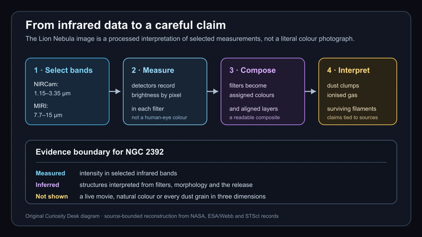
A useful way to read the release is as a chain. Webb’s detectors record light through selected filters; the observations are calibrated and combined; image processing assigns colours and produces a composite; astronomers then interpret the resulting shapes alongside the instrument record and the physics of a dying star. Each step adds explanatory value, but none turns the final image into a natural-colour photograph or a live record of the nebula changing in real time.
The official release says the gas and dust have taken several thousand years to reach their current shape and that the nebula will keep changing. It also estimates that NGC 2392 may disperse in about 10,000 years. Those statements describe a long-running physical process. The Webb image is a snapshot of that process, not a time-lapse, and it does not by itself measure the three-dimensional position, temperature or composition of every visible-looking feature.
That boundary is what makes the image more interesting, not less. The composite shows where selected infrared signals are bright and how those patterns fit the source-backed picture of ionised gas, illuminated dust and surviving clumps. It does not ask the reader to trust colour alone. Read with the filter record, the MIRI-only view and the image-processing disclosure, it becomes a compact lesson in how astronomers turn invisible light into a careful explanation. It also gives a practical reading habit for future space images: ask what was measured, what was assigned for display and which physical claim the source actually makes.
Sources and further reading
- NASA Webb latest news listing ↗
- NASA Science: Lion Nebula Roars to Life With NASA's Webb ↗
- ESA/Webb: Lion Nebula roars to life for Webb ↗
- ESA/Webb observation: Lion Nebula NIRCam + MIRI ↗
- ESA/Webb observation: Lion Nebula MIRI ↗
- ESA/Webb image and text usage terms ↗
- NASA Science: NIRCam ↗
- NASA Science: Mid-Infrared Instrument (MIRI) ↗
- NASA Science: About Webb Images ↗
- STScI JWST documentation: NIRCam imaging filters ↗
- STScI JWST documentation: MIRI filters and dispersers ↗
This article was written for Curiosity Desk. We do not copy other publishers or invent quotes. If a material error is found, we correct it openly.
Read the full standards →One answer should lead to a better question
Bring your curiosity to the group
Curious Minds is our public Facebook community for surprising science, strange history, Australian wildlife and everyday questions. No copied posts, no personal-friend invitations and no link dumping.
- Three self-contained discussion prompts each week
- Sourced answers and honest uncertainty
- Respectful conversation without spam